"So, it has come to this: more and more people taking more and more similar pictures of the same, celebrity species and locations ... The real problem with wildlife photography is not that there is too much of it but that photographers – amateur and professional – are failing to reflect natural diversity. Far from inhibiting productivity, wildlife photography needs to be expanded greatly, telling the story of species and locations unknown to readers and viewers."
From A crisis in Nature photography: Niall Benvie
Showing posts with label criticism. Show all posts
Showing posts with label criticism. Show all posts
Wednesday, June 06, 2007


Friday, February 09, 2007
"You could not step twice into the same river..."
"... for other waters are ever flowing on to you. " - Heraclitus
To get back to talking about nature/wildlife images that break convention, here's an image by the photograpgers Verena and Georg Popp that I stumbled upon from the NPN's annual picks. There are two versions of the same basic idea, the NPN editors picked the first and then the photographers linked to the 'original'. I prefer the second and its what I have linked to.
Landscape images have by and large had three built in conventions. These are not necessarily always followed, but the winner of NPN's editors pick will attest to their 'mainstreamness'. One is that the image must be of a vista, and the other being that the image must be an f64, sharp from here to infinity and finally nothing must be moving.
All of these conventions have been broken before, in ways that have been considered effective. Michael Kenna whose work I came across through TOP uses the effect of time and motion in his work beautifully. Landscape images also sometimes deal with details within a landscape. Jim Brandenburg has this beautiful image of a not entirely frozen stream with flowing water blurred over time.
Can an image marry more than two elements?
This image does manage to combine three (!) elements of detail, motion and vista in a single frame. Each of these elements are in opposition to each other, its almost like a rock-paper-scissors set. One cannot cohabit the same image with another, yet here they are. And it manages to make these things come together and work in a simpler primal visual way; through the colour, the rush of motion and the click of discovery.
Someone's said before me that all good images have many layers to them, so does this one. The rushing colour holds and draws your attention and gives you no sense of scale, until you notice the little centre of stillness which you might guess is water. Then a few leaf like objects come to your notice. Then you look up into the picture for further clues and slowly the mountains and the pines that reflect in water come to your attention. Its this gradual unfolding of the image that makes it special; as you spend time with it, it rewards you with more and more.
And thats just the visual aspect, I'm sure everyones mind then wanders on to the juxtaposition of a fast moving stream with a seemingly immutable mountain. My mind wandered to Heraclitus, and then through Lyell and his version of a mutable earth, to the fact that the river of time flows over mountains as well, eroding and wearing them into spires. The image is taken in Triglav National Park in Slovenia, a little digging around suggests that the Triglav glacier might have had some hand in carving the mountain we see before us.
Water passing over rock with time and ceaseless motion can achieve a great deal.
To get back to talking about nature/wildlife images that break convention, here's an image by the photograpgers Verena and Georg Popp that I stumbled upon from the NPN's annual picks. There are two versions of the same basic idea, the NPN editors picked the first and then the photographers linked to the 'original'. I prefer the second and its what I have linked to.
Landscape images have by and large had three built in conventions. These are not necessarily always followed, but the winner of NPN's editors pick will attest to their 'mainstreamness'. One is that the image must be of a vista, and the other being that the image must be an f64, sharp from here to infinity and finally nothing must be moving.
All of these conventions have been broken before, in ways that have been considered effective. Michael Kenna whose work I came across through TOP uses the effect of time and motion in his work beautifully. Landscape images also sometimes deal with details within a landscape. Jim Brandenburg has this beautiful image of a not entirely frozen stream with flowing water blurred over time.

Can an image marry more than two elements?
This image does manage to combine three (!) elements of detail, motion and vista in a single frame. Each of these elements are in opposition to each other, its almost like a rock-paper-scissors set. One cannot cohabit the same image with another, yet here they are. And it manages to make these things come together and work in a simpler primal visual way; through the colour, the rush of motion and the click of discovery.
Someone's said before me that all good images have many layers to them, so does this one. The rushing colour holds and draws your attention and gives you no sense of scale, until you notice the little centre of stillness which you might guess is water. Then a few leaf like objects come to your notice. Then you look up into the picture for further clues and slowly the mountains and the pines that reflect in water come to your attention. Its this gradual unfolding of the image that makes it special; as you spend time with it, it rewards you with more and more.
And thats just the visual aspect, I'm sure everyones mind then wanders on to the juxtaposition of a fast moving stream with a seemingly immutable mountain. My mind wandered to Heraclitus, and then through Lyell and his version of a mutable earth, to the fact that the river of time flows over mountains as well, eroding and wearing them into spires. The image is taken in Triglav National Park in Slovenia, a little digging around suggests that the Triglav glacier might have had some hand in carving the mountain we see before us.
Water passing over rock with time and ceaseless motion can achieve a great deal.
Tuesday, October 31, 2006
Rosamund Purcell
 I first came across her work which was used in Nat Geo feature written by Carl Zimmer.
She's been called the doyen of decay. I can see why. She is among other things, a museum photographer, so a lot of the stuff she shoots is dead. When she shot some marine creatures at Woods Hole she actually said that she doesn't see too many alive specimens!
It must be a strange thing to see animals, so inanimate and yet create images that inform their biology. As it were a photographs compress so much. They're a single snapshot, static & they're two dimensional. But I think she does justice to her subjects. She actually manages to add certain degree of dynamism and mystery to her images.

A Wildlife photographer? Maybe, but shes a much more expansive artist than that. She's done many books, exhibitions and collections on things that range from images of extinct animals to dice(!). In another book Owl's head she goes through the keepings of junk dealer in a more modern version of archaelogy to understand us and our recent history through our discardings.
(Just as an aside, here's a sort of related project, a recreation/imagination of what dodo behaviour, ecology might seemed like when they were alive.)
The photograph is copyright Rosamund Purcell, from here.
Tuesday, October 10, 2006
Talking some more
When he still wrote a free and regular column called the Sunday morning photographer, Mike Johnston was one of my favourite reads. One of my utterly favourite column was called "Scenic fatigue". I think I'm going through that sort of fatigue with shooting in general, I get exhausted just looking at my pictures.
Oh, I don't think I'm doing unfocused photography, there is a story to tell (more about the story itself when I feel like telling). Just sometimes I think that theres a huge danger in nature photography that you'll have everything just so and empty it of photography and leave it all biology or worse, prettiness. The interesting subject, rule of thirds, perfect light, colours, sharpness, low grain, selective focus, the little catchlight in the eye, the action/dynamism shot....you know. There are too many conventions/rules in this business. And too many times keeper shots are keepers because the meet an appropriate convention.
How do you break this little problem, cause all of those conventions do have a reason you know? They make things look...good. In a certain way. So I think I'm getting on a mission now, to find images (not necessarily mine), nature photography images that look good while breaking at least one convention... and then see whether I can work through, why the image works....lets see how it goes...
(I'm using this image for criticism, which I believe is ok under the fair use clause of the US copyright act. I've linked the originals and credited the author.)
 We'll start with the obvious guy, Mike 'Nick' Nichols. He's a out there 'I dont want to make pretty pictures' nature photographer. This compelling shot was taken as part of his project called 'Brutal kinship' on the nature of the relationships between humans and chimpanzees.
It's not a pretty picture, and some would argue its not even a nature picture. Does it break conventions? Some, you dont see the eyes of the animal, the face is hacked at the chin. (This is probably so its possible to look at the picture without turning away in disgust.) Its a portrait of an animal with no identity, which defies the genre portrait itself.
There's blood in the image and theres no denying the agony in those hands being restrained. The animal frames his own blood as in an act of display; "here, here's my death". There's no attempt however to prettify it, neither to judge the death as needless. The syringes, the tubing both suggest medical intervention in some form. Either an attempt to save the animal or maybe what caused the death in the first place.
The caption tells us its a chimp that died of systemic failure after a vaccine against HIV almost worked on it. It almost saved so many lives but died. Its a matyr's image. Its not an image of an animal, its an image of what happened. Its littered with clues to what might have happened and leaves us to figure it out before the caption reveals it. I think the tension already exists in the image, the justification of the death is ambiguous, and yet this is not an obvious 'animal rights' image. It becomes more so with the caption. But it does not lean so far as to condone the whole extreme animal rights stand of never using animals for research. Its a marvellous walking of the thin line, and in my opinion its why it works.
Oh, I don't think I'm doing unfocused photography, there is a story to tell (more about the story itself when I feel like telling). Just sometimes I think that theres a huge danger in nature photography that you'll have everything just so and empty it of photography and leave it all biology or worse, prettiness. The interesting subject, rule of thirds, perfect light, colours, sharpness, low grain, selective focus, the little catchlight in the eye, the action/dynamism shot....you know. There are too many conventions/rules in this business. And too many times keeper shots are keepers because the meet an appropriate convention.
How do you break this little problem, cause all of those conventions do have a reason you know? They make things look...good. In a certain way. So I think I'm getting on a mission now, to find images (not necessarily mine), nature photography images that look good while breaking at least one convention... and then see whether I can work through, why the image works....lets see how it goes...
(I'm using this image for criticism, which I believe is ok under the fair use clause of the US copyright act. I've linked the originals and credited the author.)
 We'll start with the obvious guy, Mike 'Nick' Nichols. He's a out there 'I dont want to make pretty pictures' nature photographer. This compelling shot was taken as part of his project called 'Brutal kinship' on the nature of the relationships between humans and chimpanzees.
It's not a pretty picture, and some would argue its not even a nature picture. Does it break conventions? Some, you dont see the eyes of the animal, the face is hacked at the chin. (This is probably so its possible to look at the picture without turning away in disgust.) Its a portrait of an animal with no identity, which defies the genre portrait itself.
There's blood in the image and theres no denying the agony in those hands being restrained. The animal frames his own blood as in an act of display; "here, here's my death". There's no attempt however to prettify it, neither to judge the death as needless. The syringes, the tubing both suggest medical intervention in some form. Either an attempt to save the animal or maybe what caused the death in the first place.
The caption tells us its a chimp that died of systemic failure after a vaccine against HIV almost worked on it. It almost saved so many lives but died. Its a matyr's image. Its not an image of an animal, its an image of what happened. Its littered with clues to what might have happened and leaves us to figure it out before the caption reveals it. I think the tension already exists in the image, the justification of the death is ambiguous, and yet this is not an obvious 'animal rights' image. It becomes more so with the caption. But it does not lean so far as to condone the whole extreme animal rights stand of never using animals for research. Its a marvellous walking of the thin line, and in my opinion its why it works.
Thursday, July 27, 2006
Photograph as witness
The title of this phrase is modified from a chapter title from a book called "Reading pictures". One of things that the author argues in that chapter is that people often have to be convinced that an image, even if its a photograph is not merely a recording of a scene. He argues that what is 'out there' filters through many layers of perception and interpretation as the photographer clicks it and you see it. He also talks about how this is something the average viewer finds hard to grasp and spends quite a bit of time convincing you of his proposition. I've been convinced.
Interestingly, others, scientists, apparently always were. Its an interesting contrast and the reasons for why are also interesting. I hope you can access the science url.
What is also interesting is that while the photograph gained acceptability at one stage as acceptable 'data'. It has now to an extent lost its credibility and journals are now beginning to look at ways of catching fraudsters. The doctored stem cell images from Dr Hwang Woo-suk being one of the more recent high profile scandals.
Some like to blame Digital imaging and photoshop for this. I'm not so sure; as many have pointed out before, manipulation is not new. Digital imaging makes it easier, it wasn't impossible before and people did it. Summerlin and his felt tip markers are a famous example . But having done some darkroom work myself (not in science, in photography), I can certainly tell you, dodging and burning ain't hard baby! Heck that would be enough to make gel bands appear and disappear.
The other area where a viewer tends to see the photograph as witness is journalism. Now I really can't say this about India, but elsewhere, the notion of journalists as seekers of truth has always been popular. And by extension the photojournalist. Yet Migrant mother, Dorothea Lange's arguably most famous photograph, has its own elements of deception. It is believed that she directed the photograph and perhaps lied about their stories in an attempt to make them sound worse than they were. OJ Simpsons pictures in TIME were much talked about, images of Iraq were doctored.
Even when images aren't doctored, leaving in or leaving out context can make the interpretation of their content controversial. (If you're thinking about more recent obviously emotional pictures, the emotion is precisely why I decided to leave it out.). Even which photographs get published and which left out are profound indicators of the degree of deception that goes on in public discourse.
The motivation behind such 'manipulation', post or pre-exposure, of course, is that photographers want to tell a story. That every image has an intentionality behind it. Sometimes the details before them do not fit that vision. If you ask me, Langes image isn't a lie. Some migrant families did face the situations that she talked about and the image had the effects that she wished it to. Off course she gained from it as well, but there can be no doubt that the intent was not to merely to cement her reputation as a photographer, but to help. I think her life attests to that.
So when is a photograph a lie? I believe it is no more a lie than a truth. Unless of course it asserts its literal veracity and isn't true. This can also be hard to judge, whether its asserts any such thing.
What are the standards to which a photograph is to be held? The same that you hold any representational art to, all that was 'out there' is now boxed in a small space through the filters of many peoples perceptions, the photographers, the editors and yours.
Are we to read it as 'literal truth'? Unless you enjoy self deception, I suggest you dont.
 So far, this is advice to people looking at pictures, how they might interpret them. But I also take pictures, so how do i approach that? (And btw I do manipulate, I've added moons, I've removed a branch and dust spots, created composites and the usual levels, curves, etc. )
So the other direction I personally come to this debate is the idea in nature photography that images should not be manipulated (especially after the advent of digital tech). Guy Tal makes an impassioned appeal for why he thinks its bollicks. I personally think its impossible, for reasons stated before, and stated again i.e. everythings manipulated.

Is it then a question of degree? But I remember my Logical fallacy 101 lessons, truth isn't heirarchical. There isn't a 'higher' or 'truer' truth, theres just one consistent truth. So no, we cant take recourse to that.
I believe, theres only one thing in any image, a realisation of an intention, the photographers or if its part of a larger piece, that of whoever put that together. The realisation maybe good or poor thats another issue. But the image can depending on your purposes contravene any rule of reality.
From a photographers point of view, if I present my images in the context of representing nature, biology, I don't want them contravening biological reality. But that doesn't mean not manipulating, it means not contravening biological reality, so thats my brief.
If I present them as art, I don't have too many rules, I just try and keep from killing my own intention. Like the intention of posting short!
Interestingly, others, scientists, apparently always were. Its an interesting contrast and the reasons for why are also interesting. I hope you can access the science url.
What is also interesting is that while the photograph gained acceptability at one stage as acceptable 'data'. It has now to an extent lost its credibility and journals are now beginning to look at ways of catching fraudsters. The doctored stem cell images from Dr Hwang Woo-suk being one of the more recent high profile scandals.
Some like to blame Digital imaging and photoshop for this. I'm not so sure; as many have pointed out before, manipulation is not new. Digital imaging makes it easier, it wasn't impossible before and people did it. Summerlin and his felt tip markers are a famous example . But having done some darkroom work myself (not in science, in photography), I can certainly tell you, dodging and burning ain't hard baby! Heck that would be enough to make gel bands appear and disappear.
The other area where a viewer tends to see the photograph as witness is journalism. Now I really can't say this about India, but elsewhere, the notion of journalists as seekers of truth has always been popular. And by extension the photojournalist. Yet Migrant mother, Dorothea Lange's arguably most famous photograph, has its own elements of deception. It is believed that she directed the photograph and perhaps lied about their stories in an attempt to make them sound worse than they were. OJ Simpsons pictures in TIME were much talked about, images of Iraq were doctored.
Even when images aren't doctored, leaving in or leaving out context can make the interpretation of their content controversial. (If you're thinking about more recent obviously emotional pictures, the emotion is precisely why I decided to leave it out.). Even which photographs get published and which left out are profound indicators of the degree of deception that goes on in public discourse.
The motivation behind such 'manipulation', post or pre-exposure, of course, is that photographers want to tell a story. That every image has an intentionality behind it. Sometimes the details before them do not fit that vision. If you ask me, Langes image isn't a lie. Some migrant families did face the situations that she talked about and the image had the effects that she wished it to. Off course she gained from it as well, but there can be no doubt that the intent was not to merely to cement her reputation as a photographer, but to help. I think her life attests to that.
So when is a photograph a lie? I believe it is no more a lie than a truth. Unless of course it asserts its literal veracity and isn't true. This can also be hard to judge, whether its asserts any such thing.
What are the standards to which a photograph is to be held? The same that you hold any representational art to, all that was 'out there' is now boxed in a small space through the filters of many peoples perceptions, the photographers, the editors and yours.
Are we to read it as 'literal truth'? Unless you enjoy self deception, I suggest you dont.
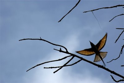 So far, this is advice to people looking at pictures, how they might interpret them. But I also take pictures, so how do i approach that? (And btw I do manipulate, I've added moons, I've removed a branch and dust spots, created composites and the usual levels, curves, etc. )
So the other direction I personally come to this debate is the idea in nature photography that images should not be manipulated (especially after the advent of digital tech). Guy Tal makes an impassioned appeal for why he thinks its bollicks. I personally think its impossible, for reasons stated before, and stated again i.e. everythings manipulated.
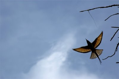
Is it then a question of degree? But I remember my Logical fallacy 101 lessons, truth isn't heirarchical. There isn't a 'higher' or 'truer' truth, theres just one consistent truth. So no, we cant take recourse to that.
I believe, theres only one thing in any image, a realisation of an intention, the photographers or if its part of a larger piece, that of whoever put that together. The realisation maybe good or poor thats another issue. But the image can depending on your purposes contravene any rule of reality.
From a photographers point of view, if I present my images in the context of representing nature, biology, I don't want them contravening biological reality. But that doesn't mean not manipulating, it means not contravening biological reality, so thats my brief.
If I present them as art, I don't have too many rules, I just try and keep from killing my own intention. Like the intention of posting short!
Friday, July 14, 2006
Water
I learnt to swim recently, pretty late in life, I guess. The first thing I had to do was get comfortable in the water, believe me it's still a struggle sometimes, I can get all tense if things aren't quite so...But the one image that kept me going, that was the motivation to learn to swim, was this image of leaping in and cuting my way face first through this blue thing. Oh, I know it sounds stupid and very 'filmy', but God, that image has a sense of abandon and freedom I am not equal to, I love it.
Water has, as I see it, power to transform, to change beyond recognition. Through it's brute force, partly through its indifference all things are equally brutalised or loved depending on how you see it.
So you can imagine that when I saw the presentation 'The seventh wave" at Magnum I was kind of sucked in and blown away. The photographer Trent Parke it says is their only Aussie photographer, he's also a sports photographer and a much decorated one at that.
His images seem to sometimes say that we're not creatures that belong in water. We remain at the threshold, afraid and fascinated. When we're in this environment, we're aliens. We are afraid of it and yet conquer it, there is triumph in our mastering it and ourselves. Some of our alienation has to do with a loss of innocence (you know water and the womb and so on). The water separates the child and mom. It does not distort the innocent but brutalises her. Hence, eventually us and water isn't about mastery but about return; a return to safety, to silence, to acceptance.
Water isolates us, deprives us of many of our senses, sound, smell, vision. Yet it encloses us in a way that is sensible. Unlike the way that wind makes us aware of air, we are always aware of water, whether mobile or not. This can induce both comfort and panic, its eventually not about the indifferent water, it is about us. It is about temperament.
I enjoy solitude; a long swim is one of my favourite ways of isolating myself. Swimming the middle lane in an empty pool is the closest I've ever come to flying.
Water has, as I see it, power to transform, to change beyond recognition. Through it's brute force, partly through its indifference all things are equally brutalised or loved depending on how you see it.
So you can imagine that when I saw the presentation 'The seventh wave" at Magnum I was kind of sucked in and blown away. The photographer Trent Parke it says is their only Aussie photographer, he's also a sports photographer and a much decorated one at that.
His images seem to sometimes say that we're not creatures that belong in water. We remain at the threshold, afraid and fascinated. When we're in this environment, we're aliens. We are afraid of it and yet conquer it, there is triumph in our mastering it and ourselves. Some of our alienation has to do with a loss of innocence (you know water and the womb and so on). The water separates the child and mom. It does not distort the innocent but brutalises her. Hence, eventually us and water isn't about mastery but about return; a return to safety, to silence, to acceptance.
Water isolates us, deprives us of many of our senses, sound, smell, vision. Yet it encloses us in a way that is sensible. Unlike the way that wind makes us aware of air, we are always aware of water, whether mobile or not. This can induce both comfort and panic, its eventually not about the indifferent water, it is about us. It is about temperament.
I enjoy solitude; a long swim is one of my favourite ways of isolating myself. Swimming the middle lane in an empty pool is the closest I've ever come to flying.
Friday, June 30, 2006
"Sharpness is a bourgeois concept" - H. Cartier Bresson
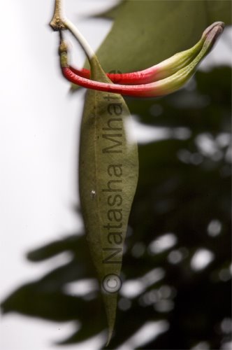 Now you wont often find nature or wildlife photographers quoting Cartier-Bresson. Or even in the least daunted by the fact that we as a community have almost no thinkers / writers /critics .
And you will almost never find them deriding sharpness. We love the soft morning light or mist. And we even love the glow of good bokeh. But the subject must be sharp, selective focus....and all that jazz.
Sometimes, I grow a bit tired of it. Sharpness, like any other feature of a photograph, exists only to serve what the photograph illustrates. I dont know if it detracts if it does not add, it does not matter I would argue. To quote another biggie, Ansel Adams "There is nothing more useless than a sharp photograph of a fuzzy concept." If the pic dictates fuzz, go ahead fuzz it.
I can't see the picture of a windblown and wild, hanging parasitic plant thats anything but fuzzy. The wind is in the fuzz, a drooping dangling plant is always at the mercy of the wind. The uncertain borders are the melting of identity that all parasites must feel. Most people who look up at these trees dont even see them as being seperate from the trees they attach to. How do you make it any other way?
Thursday, May 25, 2006
Light and line
All photos in this post except the first are not mine and are preceded by links to the original
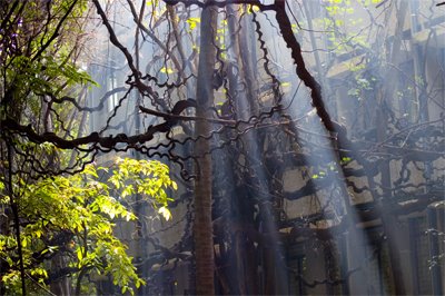 There are rewards when you wake up early in the morning. The vines are lianas (woody creepers) brought here to ces from the western ghats, planted years ago. They mesmerise everyone who sees them the first time. Its like a breath from a rainforest somewhere hit the city of bangalore. The building at the back is my department.
The reason I picked this image is that its about lines, it verges on a graphic version of a line photograph. And yet its not.
Here are a few examples of graphic line images. This one uses the classic quality of repitition.
repitition
heres repitition and symmetry breaking
rupture
Heres another, uses form, depth and curves. (And, off course, some beauiful tonality)
curves
 You'll notice that these images have very simple geometries, something that makes many line images intuitive and quick to 'grasp'. You see the image, finding the form, are led around the image exactly as the photographers eye saw it.
Occasionally the repititive line is used to dilineate form, to explore smooth curvy geometries
form

Some photographs explore the line as a twisty concept...
twisted

Few explore, straight and twisty lines in a confused ungeometric pattern. Which is why i like that picture....
 There are rewards when you wake up early in the morning. The vines are lianas (woody creepers) brought here to ces from the western ghats, planted years ago. They mesmerise everyone who sees them the first time. Its like a breath from a rainforest somewhere hit the city of bangalore. The building at the back is my department.
The reason I picked this image is that its about lines, it verges on a graphic version of a line photograph. And yet its not.
Here are a few examples of graphic line images. This one uses the classic quality of repitition.
repitition

heres repitition and symmetry breaking
rupture

Heres another, uses form, depth and curves. (And, off course, some beauiful tonality)
curves
 You'll notice that these images have very simple geometries, something that makes many line images intuitive and quick to 'grasp'. You see the image, finding the form, are led around the image exactly as the photographers eye saw it.
Occasionally the repititive line is used to dilineate form, to explore smooth curvy geometries
form

Some photographs explore the line as a twisty concept...
twisted

Few explore, straight and twisty lines in a confused ungeometric pattern. Which is why i like that picture....
Wednesday, April 19, 2006
Speed
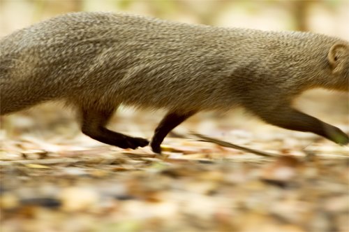 One thing about a lot of wildlife, its come and gone before you know it. A split second of something, is often all you'll ever get. If you're not fast, you wont have pictures. Think about it, I waited a few hours for this 100th of a second.
The other thing is get level. What I like most abt this image apart from the motion is that you can see the space between the ground and the belly. It's an animal that spends its life close to the ground, in the undergrowth. Its a long animal, its a hairy animal and a quick one. The image manages to convey all of that in an abstraction.
A head would distract from this message, it would give the animal an idividual personality, perhaps an expression. And we would be diverted there...maybe not such a bad thing, but it wouldnt be this picture...
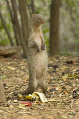 This picture for example, it suggests, tall, or actually long since the animals arent usually standing. but it adds other elements, vigiliance, and for me certainly humor in that bow-legged very awkward looking hind leg stand. theres the other elements for instance, where did this neatly peeled banana come from? and mongooses eat bananas?
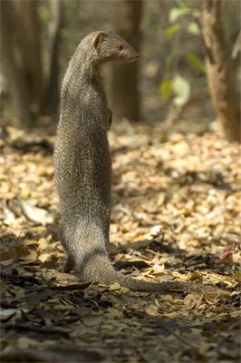 This other image of the mongoose standing taken from the back, on the other hand ,has tall / long and vigiliant. none of the other elements. its not funny, either which could be good or bad....
The subtext to all this is that photography often is about deciding how much to leave in or out. not only in elements but even in subjective experience of a picture.
Some pictures base themselves on a narrative in the elements that are in the picture. the one below for instance, theres a temple, theres offerings, theres a mongoose eating them, theres a larger looking mongoose (most likely mum) hanging around waiting in the background. you can construct a fairly complete and complex narrative around that. And these are apparently all the rage now, the complete story in a frame.
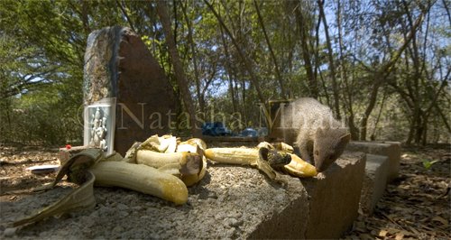 but there are complete, if not complex stories, in shots like the first one. removing elements from an image does not necessarily compact the scope of an image. but it does place greater demands on a viewer. It is therefore harder to pull off successfully.
Usually its got to trigger some instantaneous gut feeling. then give you just a couple of details and leave you with that.
the first picture, hey whats that moving so quickly. hmm legs, fur = animal, probably some long thing, didnt fit in the picture. wheres it going to in such a hurry? maybe its escaping from something. maybe not, thats always how you see critters, scurrying off to their next unknowable task...furtive, hiding under stuff, bellys scraping the ground. no wonder we hardly ever see em. just some blur off the corner of the eye. .....no wonder the weasel (this looks like one) has been associated with sneakiness...and so on
if that tenuous something can be triggered i think a photo works. off course i dont know if it does for you, you could tell me. but thats (sometimes) what i try and guess at when i pick something and discard some pics...
Friday, November 25, 2005
Change and stasis
 Few of my images betray that I shoot in a place that where humans are close by. Few pictures betray that almost all environments in my pictures are modified, however subtly, by human hands. Which is a significant omission, IISc is an urban campus. There are many people here, many buildings and much activity.
Many habitats are closely watched and controlled, grasses cut to prevent fire, paths cleared, bush cleared to protect power lines, telephone lines, buildings, etc from damage. Occasionally unnecessary things get done too, because someone making a decision thinks its an improvement. Exotics are planted, human garbage encourages some species, discourages others...and so on. People sometimes mean well, other times not. The bottom line is they alter...they change. And the animals I shoot respond to these changes.
* a little digression* i owe a guy called Sohrab Hura a bit of a debt here...many of these issues he started me thinking on.
How do you apply something thats essentially a static medium, ie photography, to document this change? (Open to ideas here)
What is the nature of change? Theres the cyclical changes of the day, the seasonal year, the cycles of rain that come and go. When do you know that a change is because of x and not because of y. Off course thats what huge areas in ecology deal in, theres tons of statistical tools like mds, pca, etc help you test these things. So in some ways thats a stupid question. And communities in relatively undisturbed forests are very dynamic and change all the time....
Its tempting to conclude that much of what I see is just that change that is part of the natural process. Yet I'm not always so sure. It's the pace in some instances that is alarming. In others that you see habitat shrink, sometimes disappear. I see the numbers of dogs go up, I see ground nesters disappear...you seem to see cause and effect in operation...its tempting and very hard to ignore. and yet theres a little guy back there that keeps screaming 'alarmist'!!!
well anyway thats a digression...human intervention is possible to depict, the hand of man has many classical and accepted visual idioms. barbed wire in one case; garbage as in the UNEP winners pictures, road kill, etc.... change however is harder to come by...
 I suppose the classic ghost in the frame effect... sometimes done with multiple exposures...other times with very low light and loooong exposure. Nichols again does a lot of this...but then he revels in low light conditions. yet that sort of change is within the now, within the frame... how do you encapsulate hours, days weeks, months, years in images?
Monet did his famous haystacks in the different seasons to show the passage of time. Ansel adams drew on that tradition when he made his famous tide images. A series, usually a triptych...*the trinity is such a christian thing, well actually, no, even we have our three guys, yeah? brahma, vishnu & maheshwara?* the success of adams approach is in that he maintains the same angle and of view and the eye immediately starts picking over the scene to spot the differences. its like frames in a video shot.
Monet of course, uses many views and angles, i find myself reconstructing the place around the haystack, theres a sense of physical space that grows out of it. good impressionist that he is he also creates an atmosphere of winter/summer...the mist and fog of winter and the harsh hazy light of summer...theres also the sense of change from the fact that many are painted at sunsrise/sunset. then theres the idea of painting haystacks, essentially things that will get used eventually, will diminish eventually as landscape. painting the mutable in the style conventionally used for something immutable, mountains, rocks...stone.
There are, of course, those that believe that transience is the one thread, one commonality that hold all photography together. The decisive moment is this isnt it...this moment caught in midflight...hold still matrix style look around, it will never happen again, never like this...(i havent read the book i confess, this entirely second hand, i dont know if this is what bresson meant at all).
Subscribe to:
Posts (Atom)